How might I establish a distinctive yet representative enough brand identity for an expanding artist, and later on convey that identity through a website?
Research
The main creative challenge relied on subtly representing the specs of Kelly’s work on the logo. She shoots mainly on film, likes texture, high contrast and is heavily influenced by fashion photography.
Things to know
- She shoots mainly on film
- Has a soft spot for grainy textures
- Likes soft and warm colors in her compositions
- Heavily influenced by fashion photography
Logo iterations

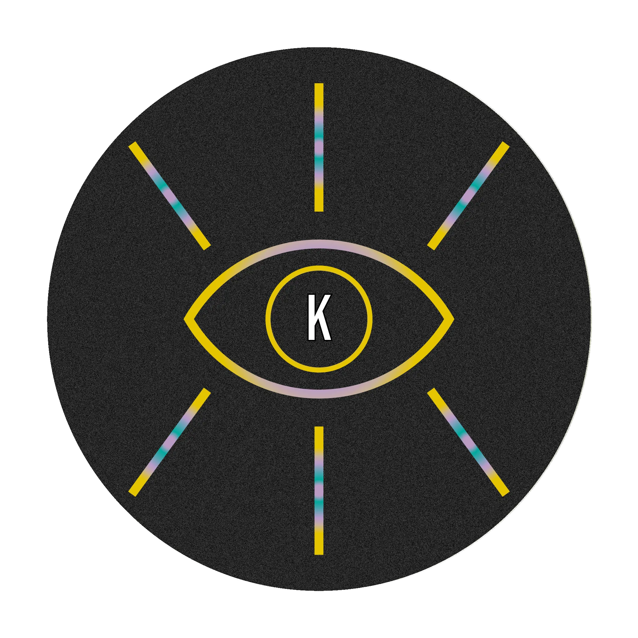
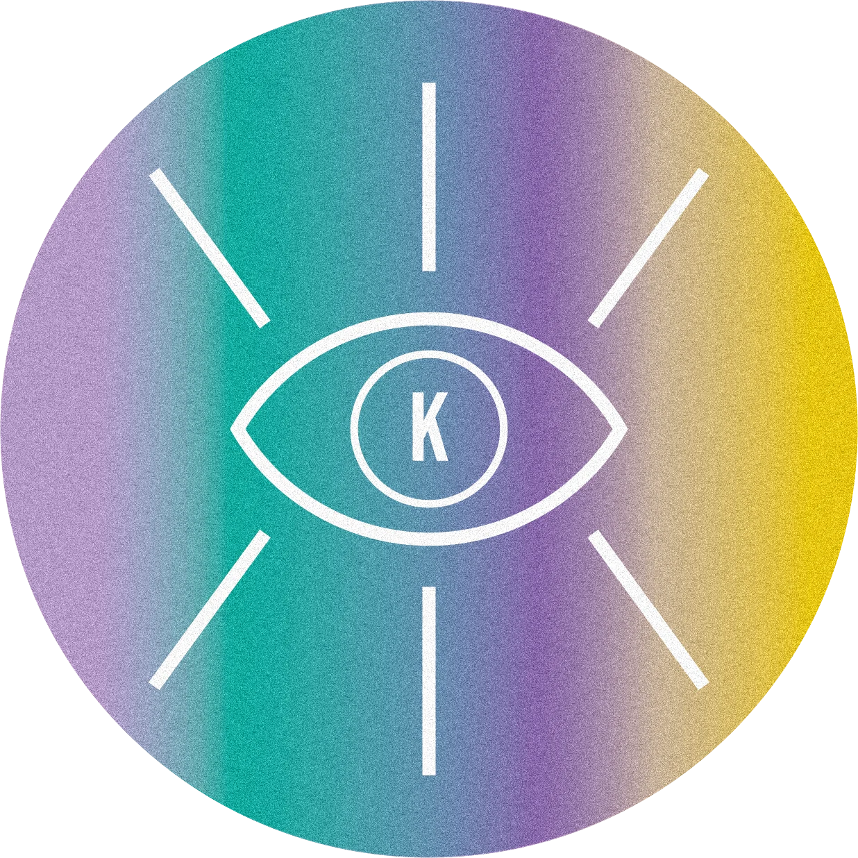
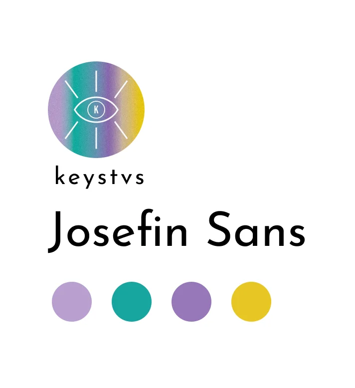
Grainy and smooth, with vibrant colors blending into each other. An eye with long eyelashes to emphasize on her expertise, photography, layered on top of her visual preferences (texture and vibrant colors)
Applications
Website
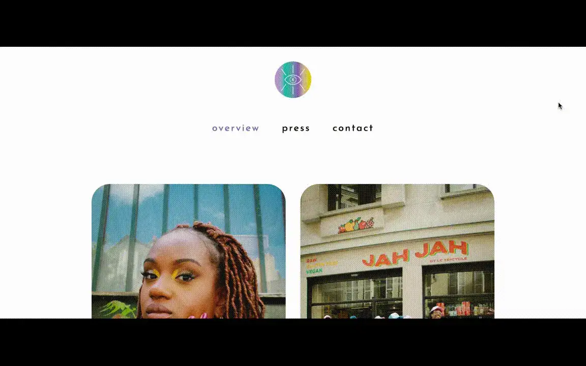

Regarding her portfolio, the aim was to go for something minimalistic yet easily distinguishable thanks to the brand elements. The interface’s minimalism was here to provide enough space to display her colorful work and allow a straightforward navigation.
Style guide
Important note
The website is no longer live today, in favor of an updated and matured identity for the photographer. You can find her work here!